GPHG Brand
Identity Pitch
In 2018, we pitched a new brand identity to the Grand Prix d’Horlogerie de Genève. As unsolicited as our advice may have been, it was a passion project we felt the need to see through.
Proposed Redesign
The new logo honours its origins, while rooting itself in the unique principles of the GPHG. The colour scheme represents the Geneva Coat of Arms, while the twelve outer points represent the number of GPHG entrant categories.
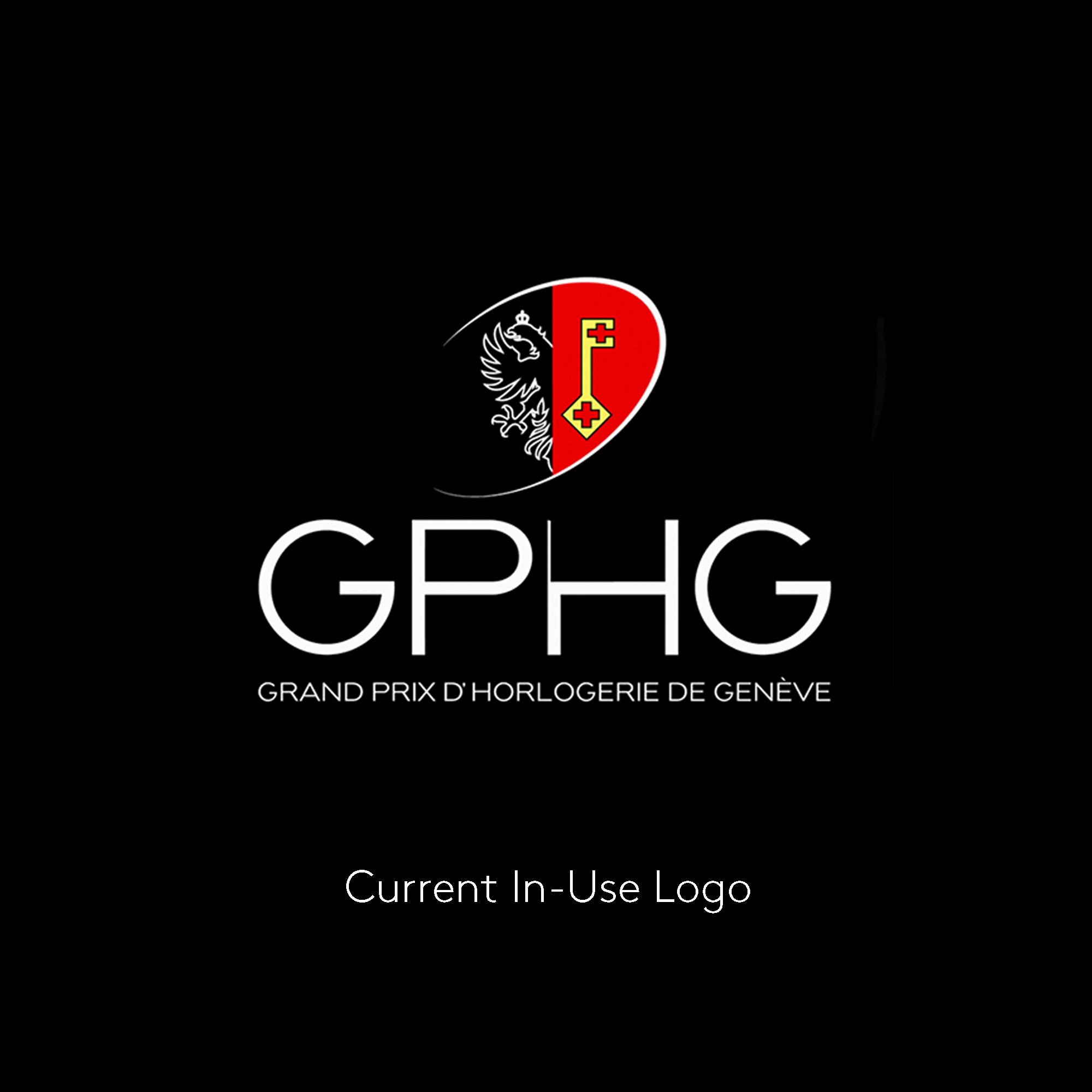
Shown here is the present GPHG brand identity. For us, this logo relies too heavily on Geneva Seal and Coat of Arms. Although receiving the Geneva Seal is a prestigious achievement for a watchmaker, we feel that the GPHG should present itself as a distinct honour.
New Proposed
Logo In-Use
Our proposed redesign is pretty versatile too. We can use the geometric elements on their own to create patterns, or crop & frame imagery. Its simplicity is its strength.
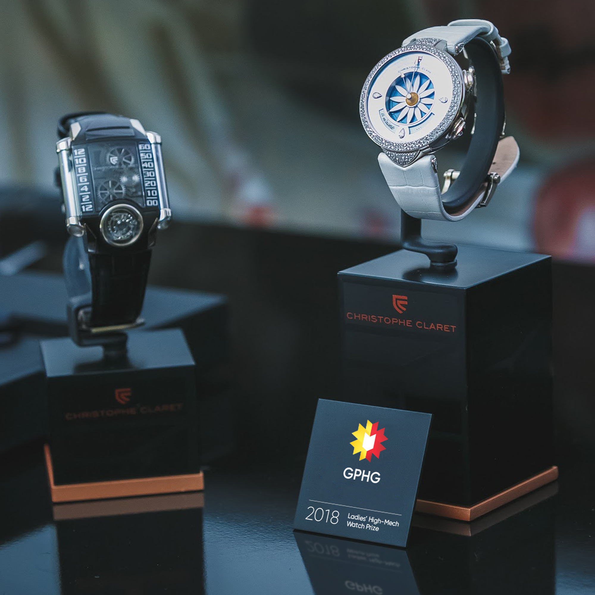
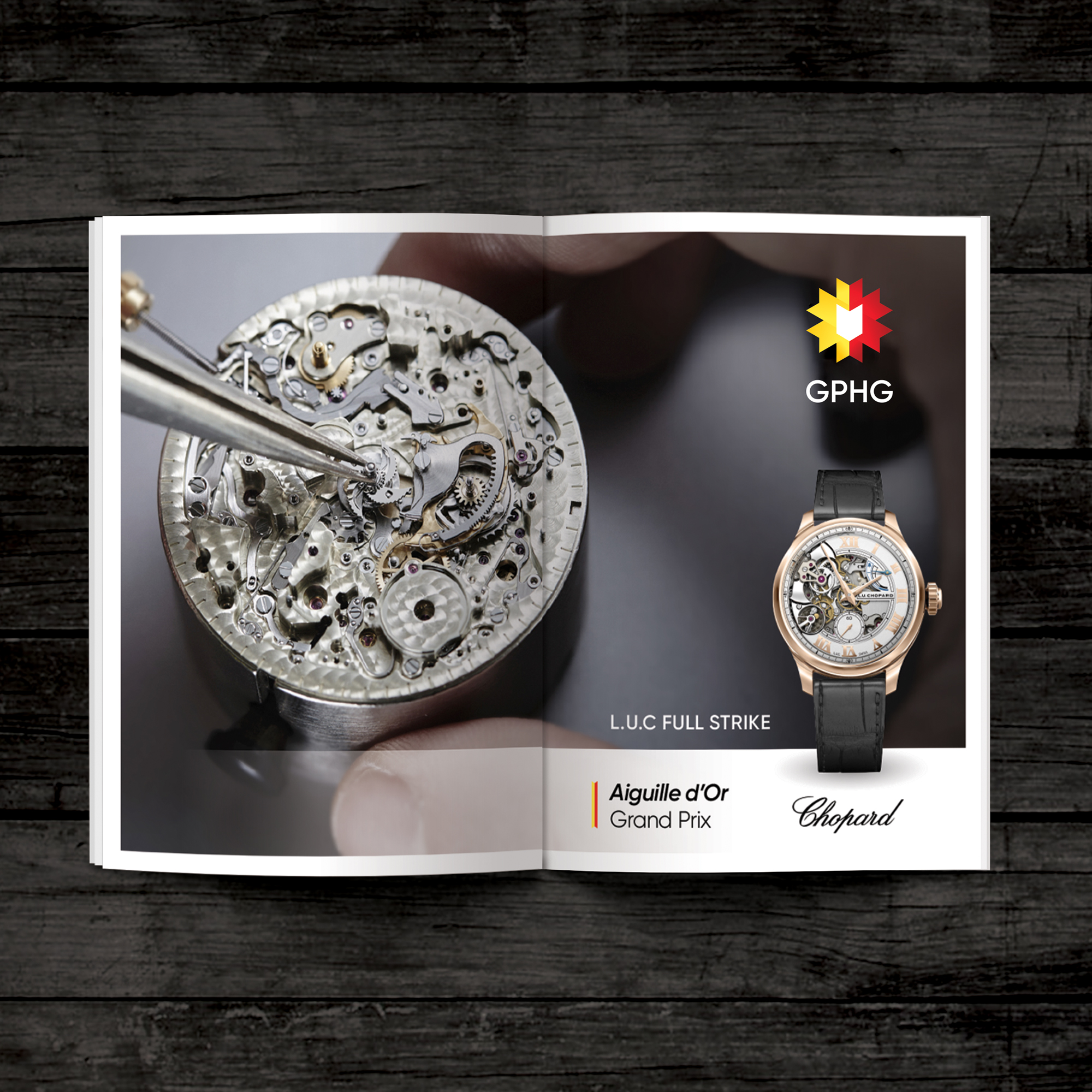
GPHG winners like to market their success. Here is a mock-up of a spread for Chopard using our proposed identity. Our proposed logo is intended to look almost like a winners ribbon or medallion, and can be much more easily applied than the current in-use branding.
And finally, we have scalability. As demonstrated by this lapel pin, our GPHG redesign remains legible at a much smaller scale than the original. This opens up new opportunities for usage, and ensures clarity through immediate recognition.