TRUST
Realty
Trust Realty wanted to develop a brand teeming with positivity, in contrast to the ‘corporate monolith’ aesthetic of its competitors. We were happy to oblige.
Name & Logo
What’s in a name? For Trust Realty, it holds their core value for selling real-estate: Trust. Like a home, it’s something you have to build, and wherever you find it you can feel secure. It’s why we decided to leverage the familiar iconography of the location pin, as a no-nonsense, straight talking symbol that shows you where Trust Realty stands.
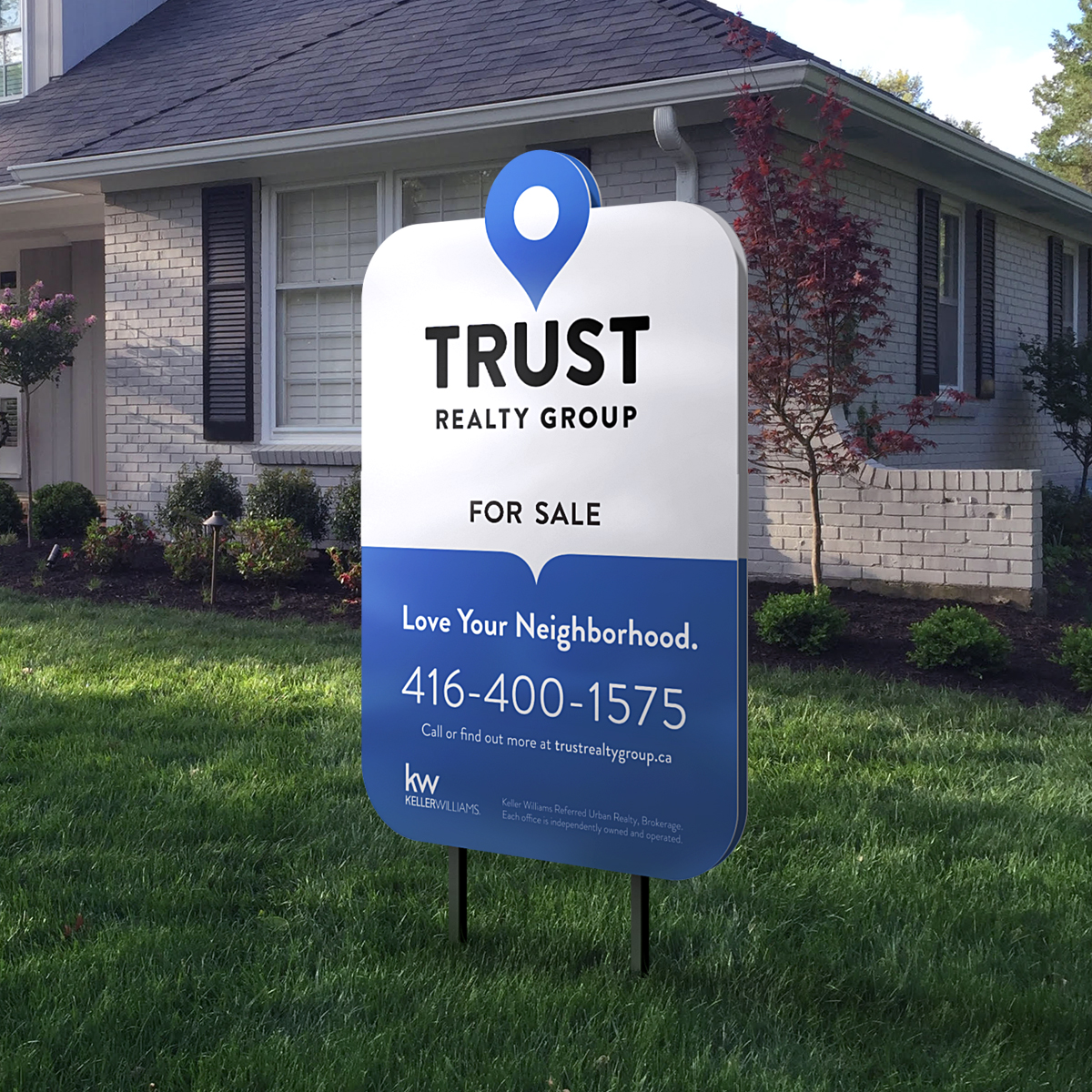
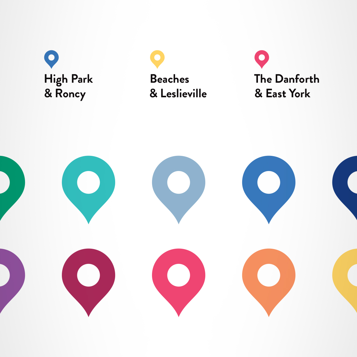
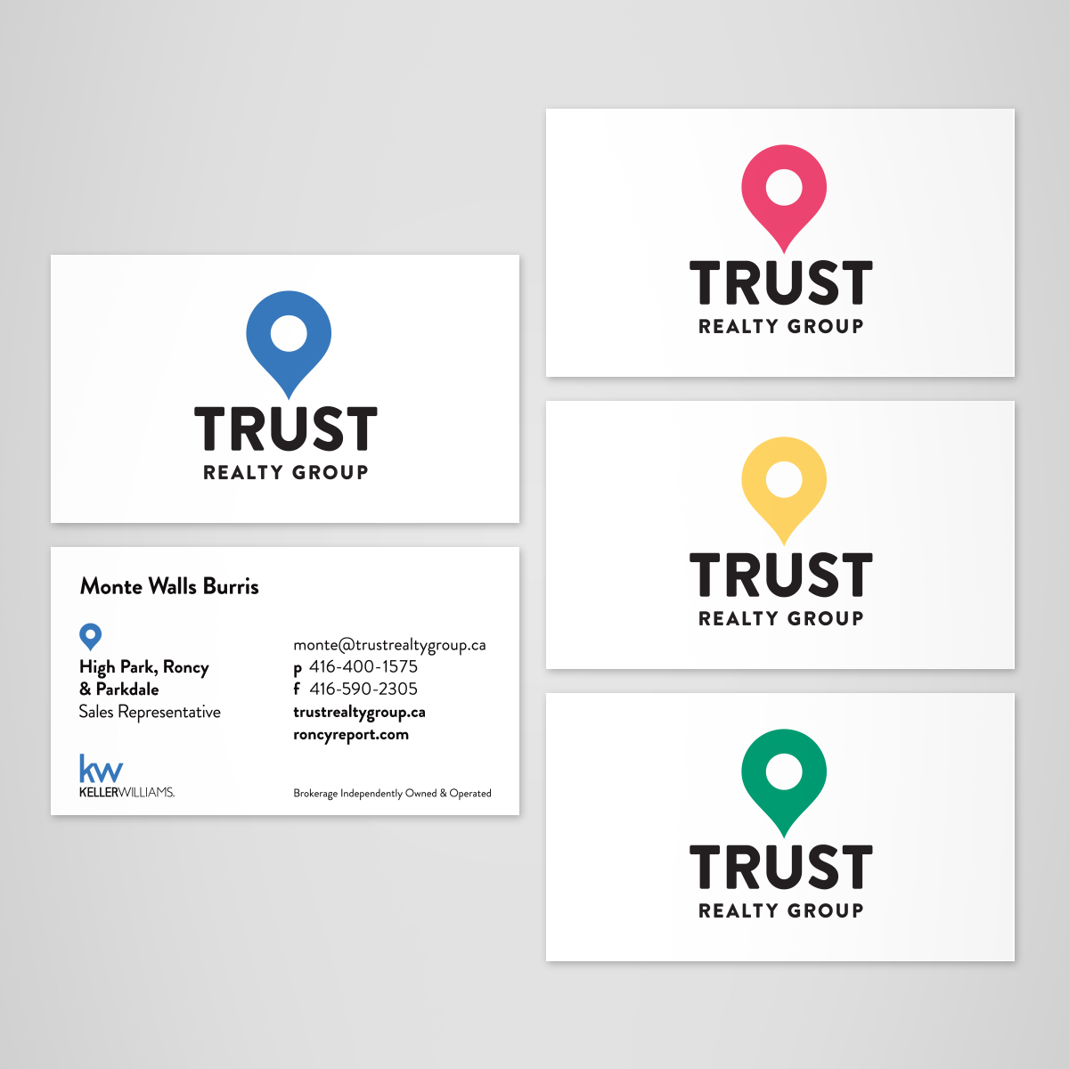
The location pin can be used in a literal fashion on the lawn signs of listed homes. They can also be colour coded to represent different neighbourhoods within the city. This allows for brand customization from agent to agent, while maintaining familiarity.
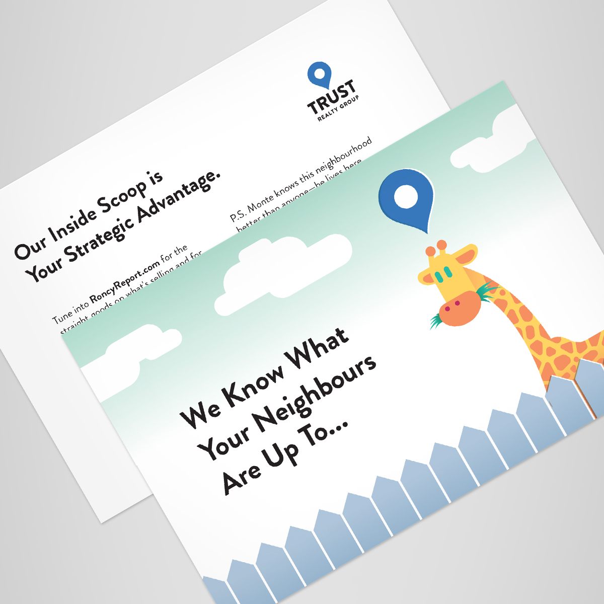

We also created some witty postcards and seminar flyers for the launch of Trust Realty. We think it’s much better than the bobblehead caricatures you’ve typically seen on realtor related collateral. And you know it is.


